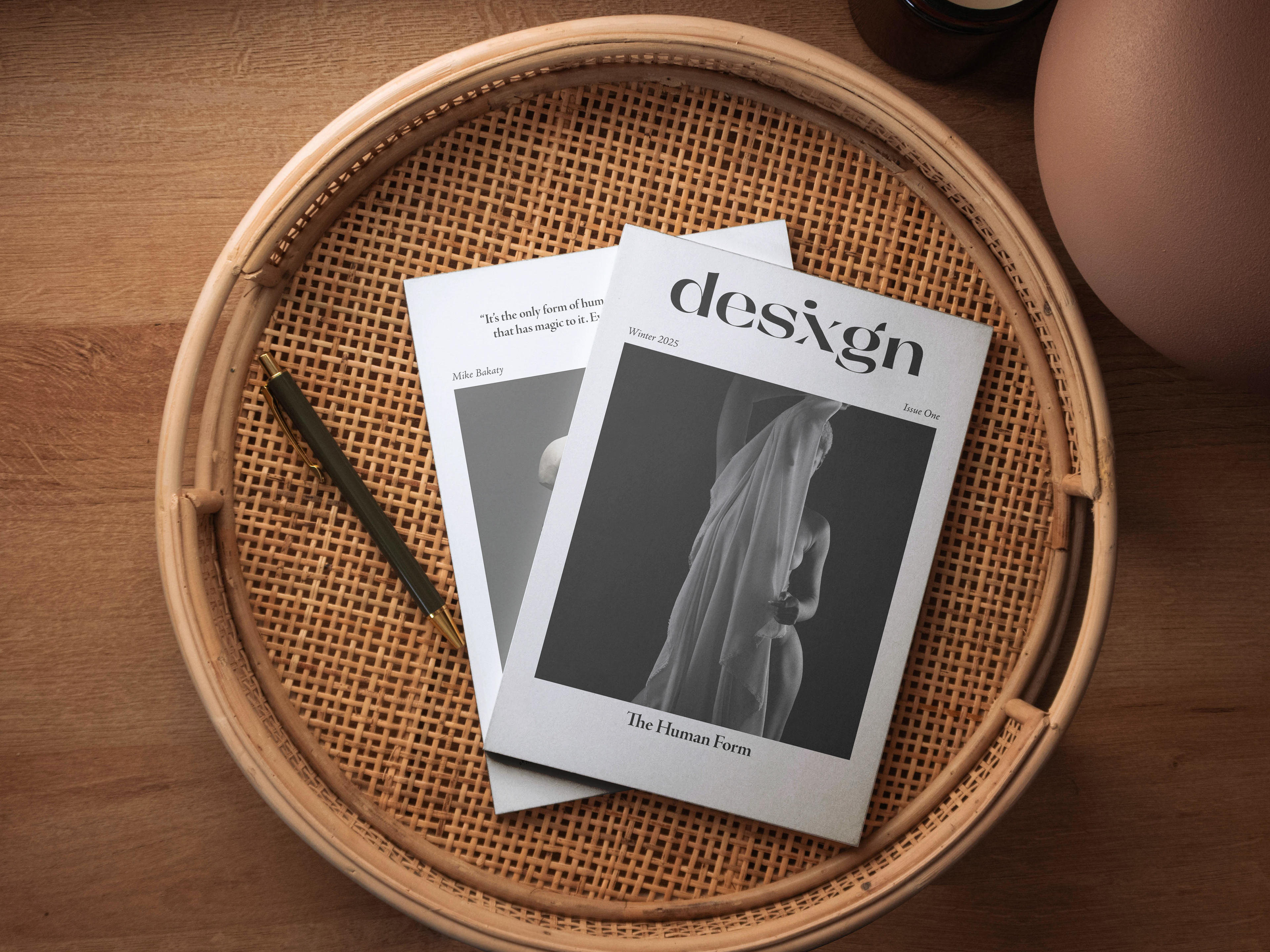
Overview
KeepsakeFM is an album co-composed by Galen Tipton and Holly Waxwing. Their musical style fuses experimental electronic with hyperpop and various other sounds, to create a unique layered effect. Galen Tipton's music has been described as: "hyperactive and intentionally overstimulating digital orchestral soundscapes" and "a hypercute take on avant-garde synth music", amongst other things.
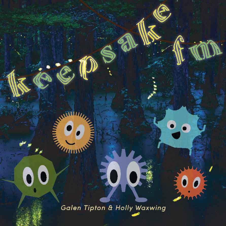
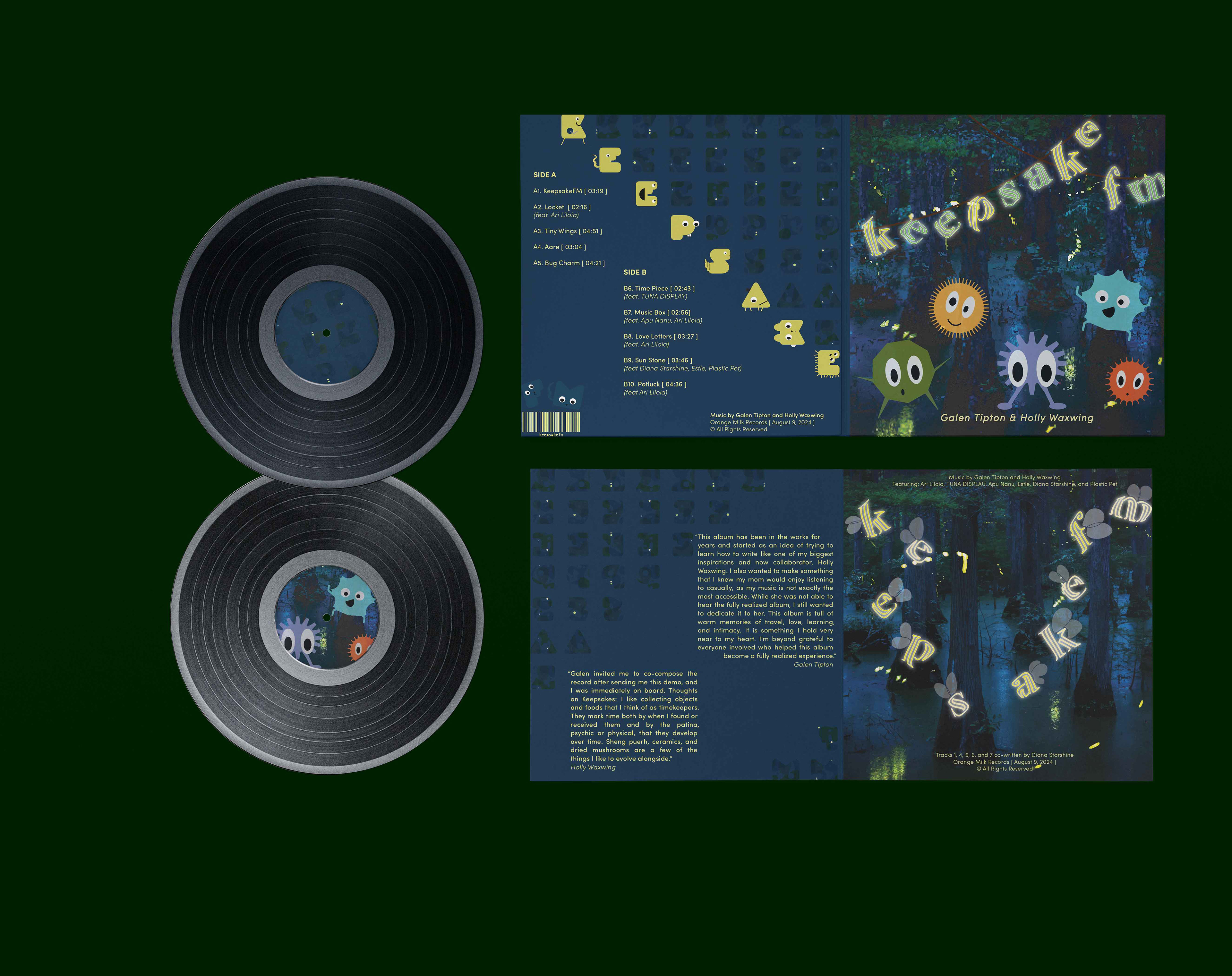
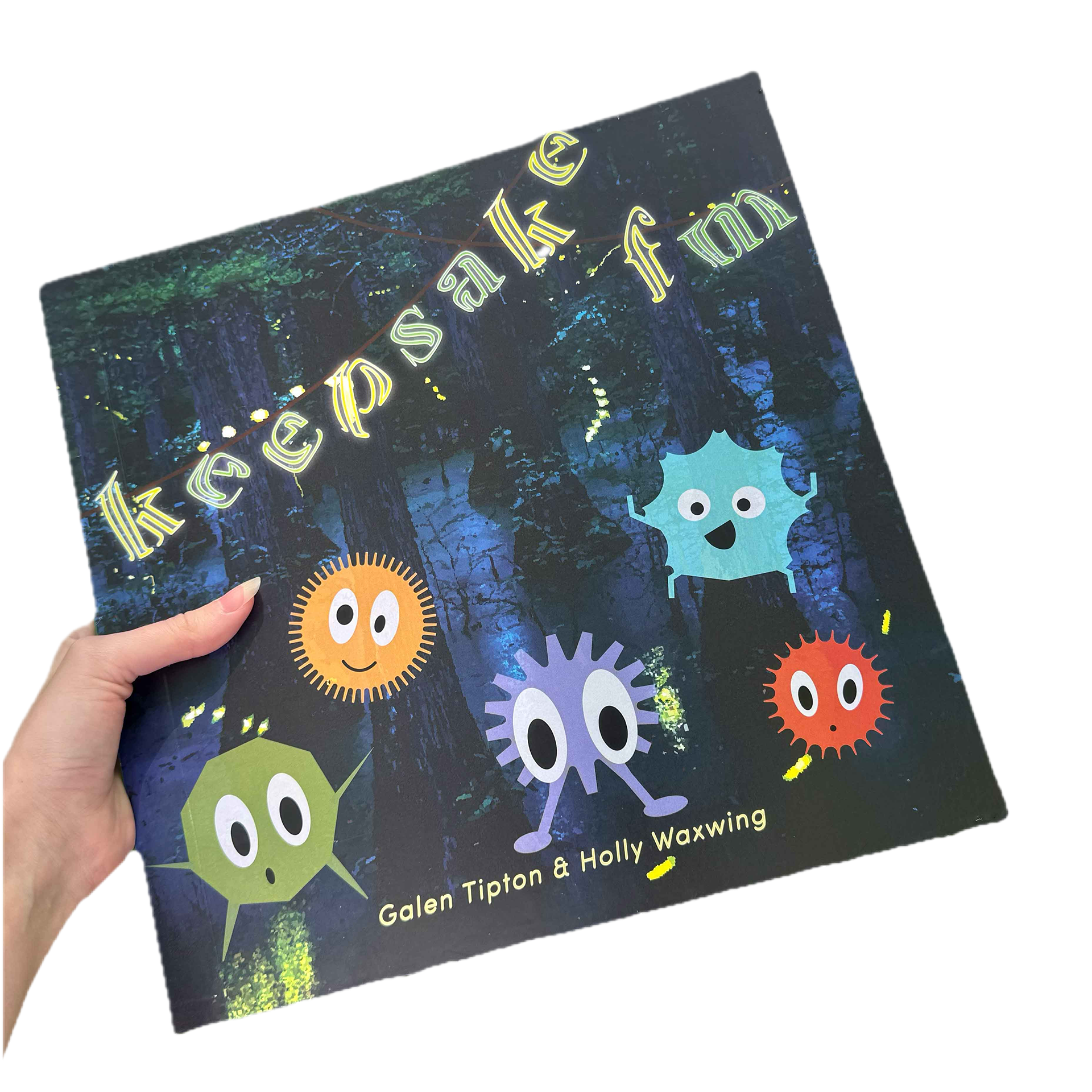
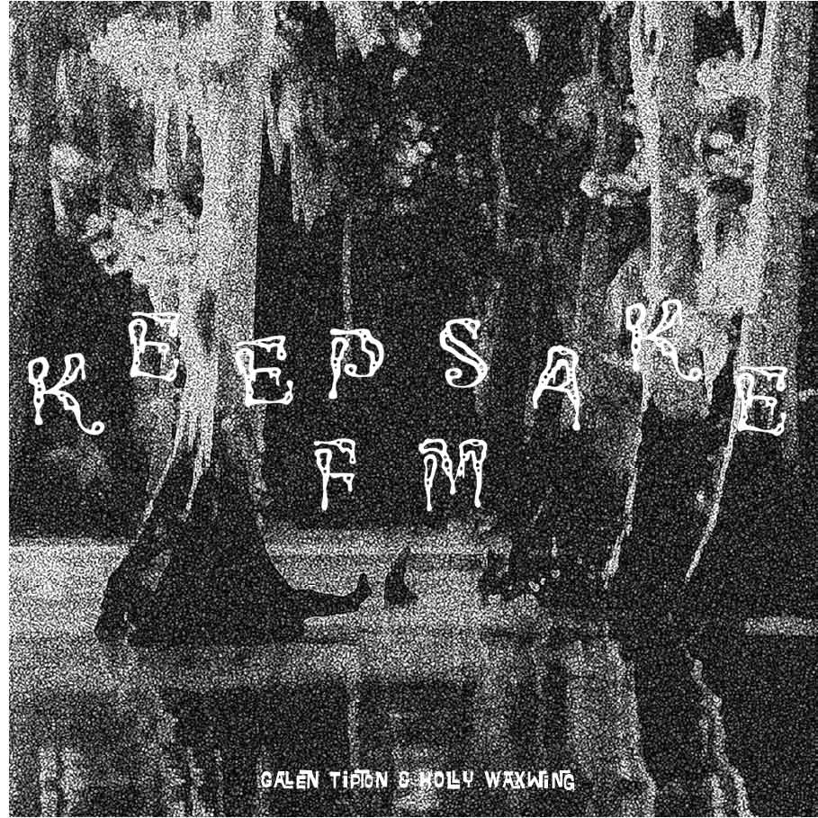
Front Cover
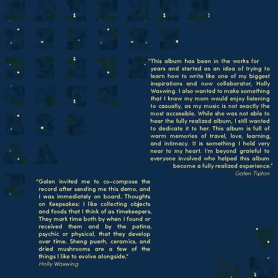
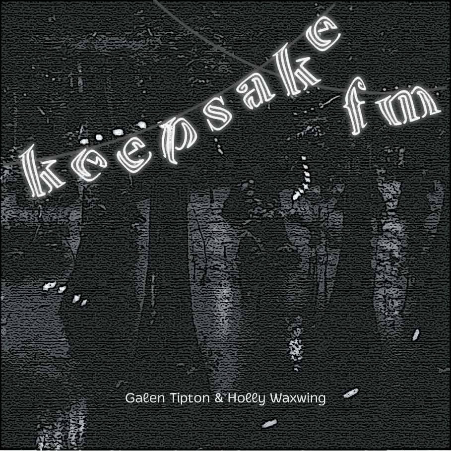
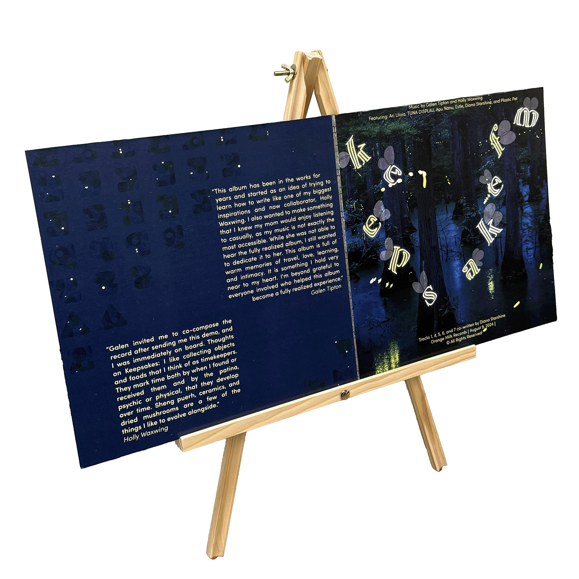
Inner Left
Challenge
As a final for my typography class, I was tasked with creating a vinyl jacket that accurately portrayed the music within it. We were also challenged to incorporate elements that would force us out of our comfort zones in one way or another.
Solution
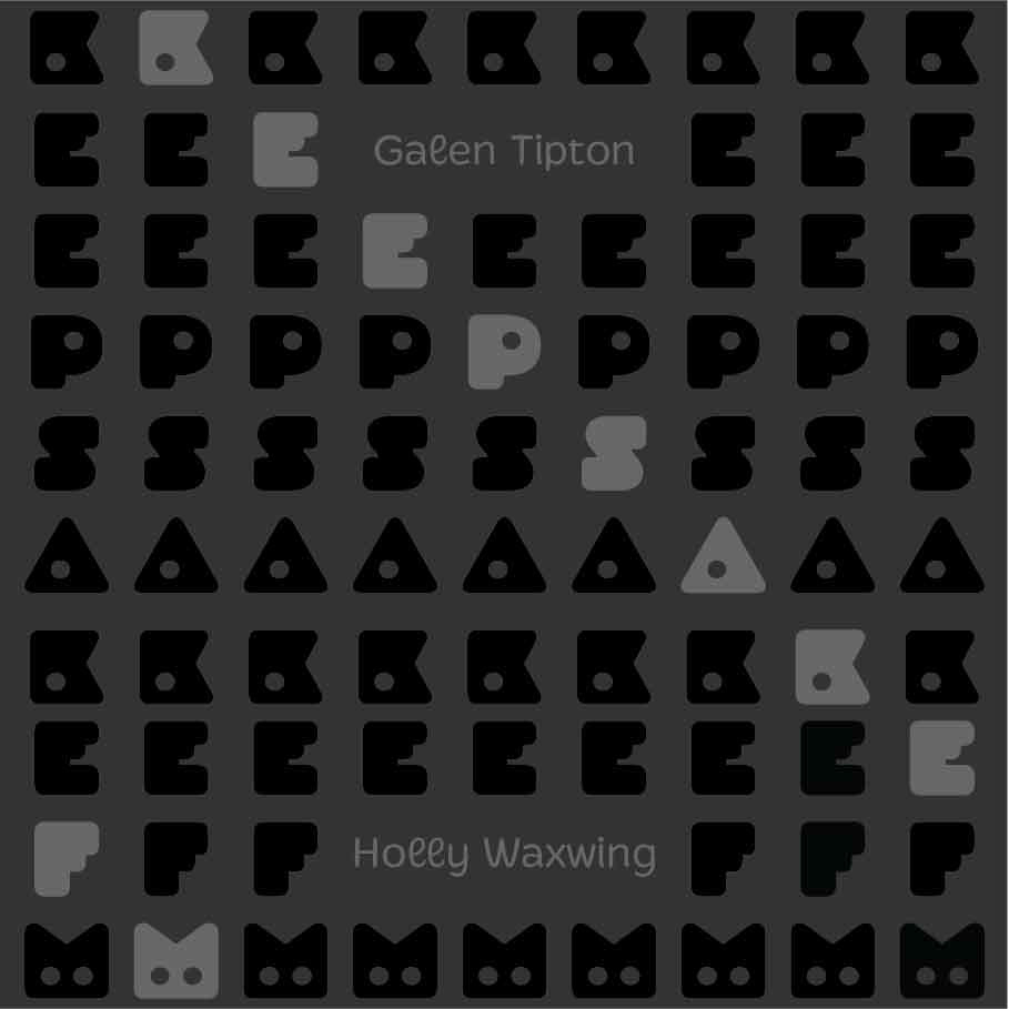
Due to the more hyper and "stimmy" nature of each song, I felt the text should compliment and highlight that feeling. It needed to be kept lively and upbeat, while holding attention and drawing viewers in by catching their eye.
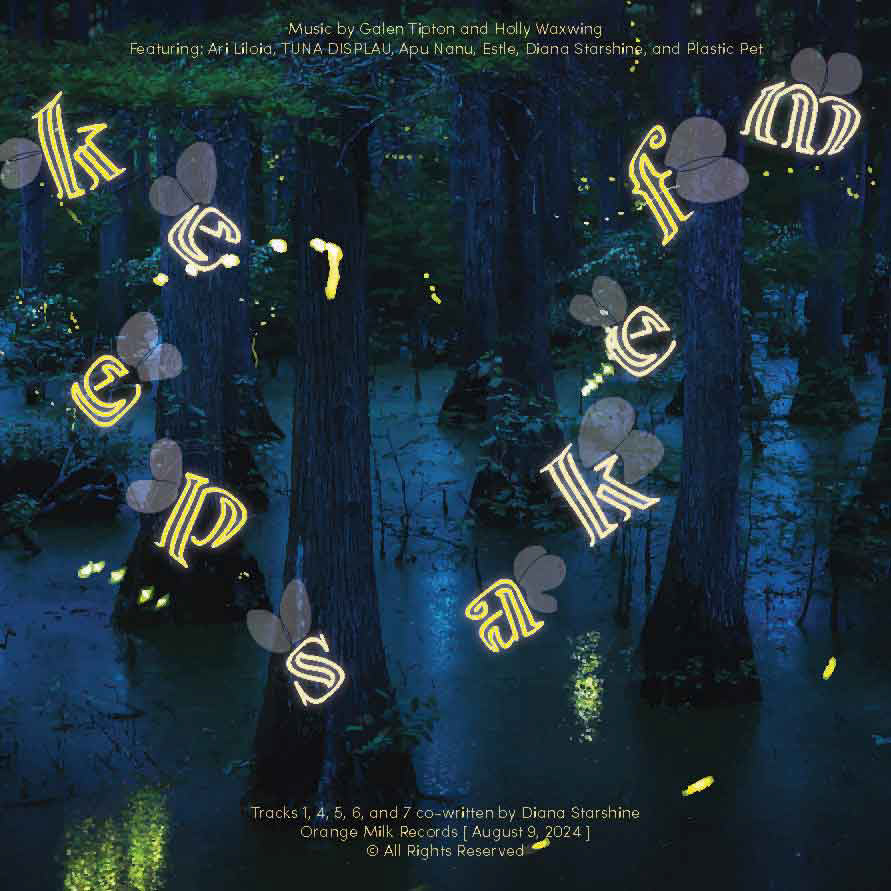
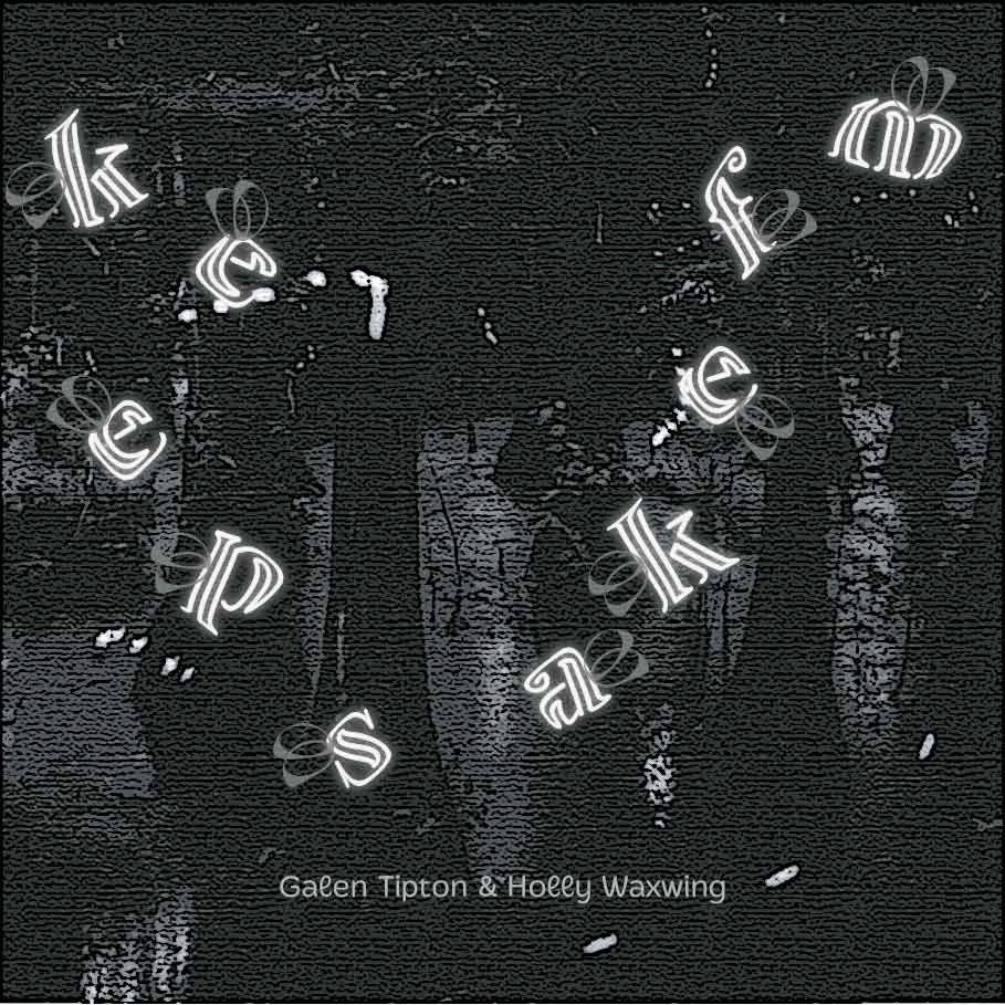
Inner Right
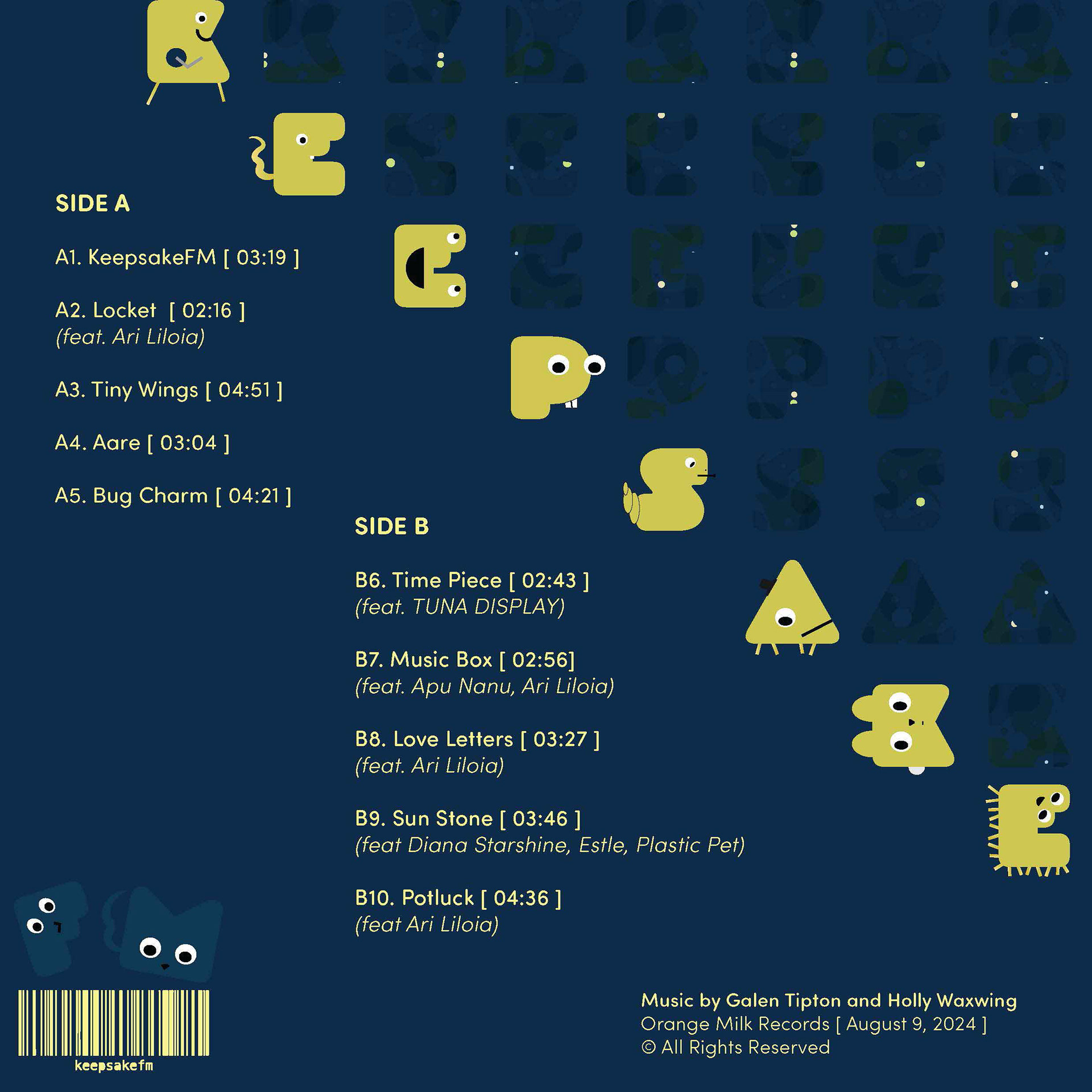
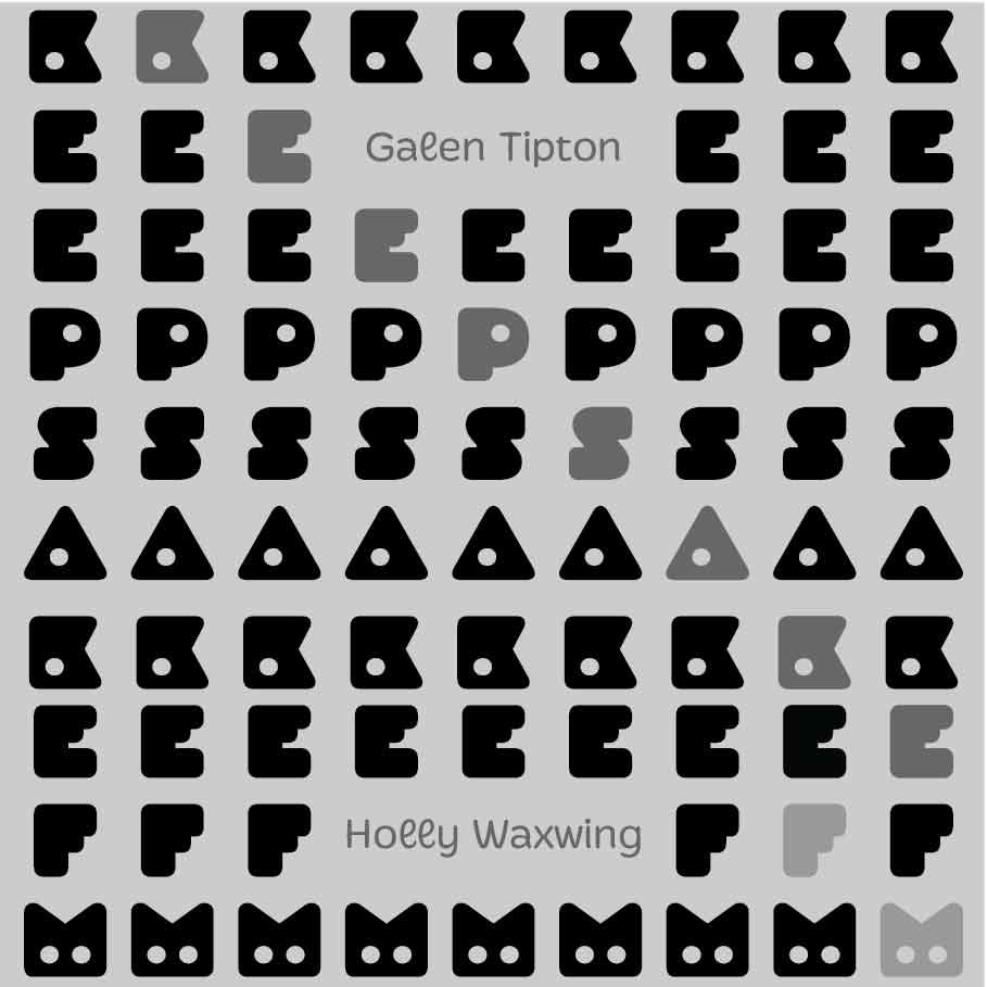
Back Cover
Project Specs:
Timeline:
3 weeks
Tools:
Adobe Illustrator, Adobe Photoshop, Google Suite, Spotify
Roles:
Researcher, Ideation/ Concept Curation, Art Director, Illustrator, Layout Design, Copywriter, Editor
Audience/ Demographic
Both artists have loyal fanbases, with monthly listeners ranging anywhere from 30,000 to 100,000 in number. Within the realm of hyperpop in particular, primary audiences consist of younger listeners, such as Gen Z-ers and those associated with platforms such as Tiktok and other online communities. It also has a strong association with the LGBTQIA+ and queer community. This style of music also draws in those interested in experimental and sound-forward tracks.
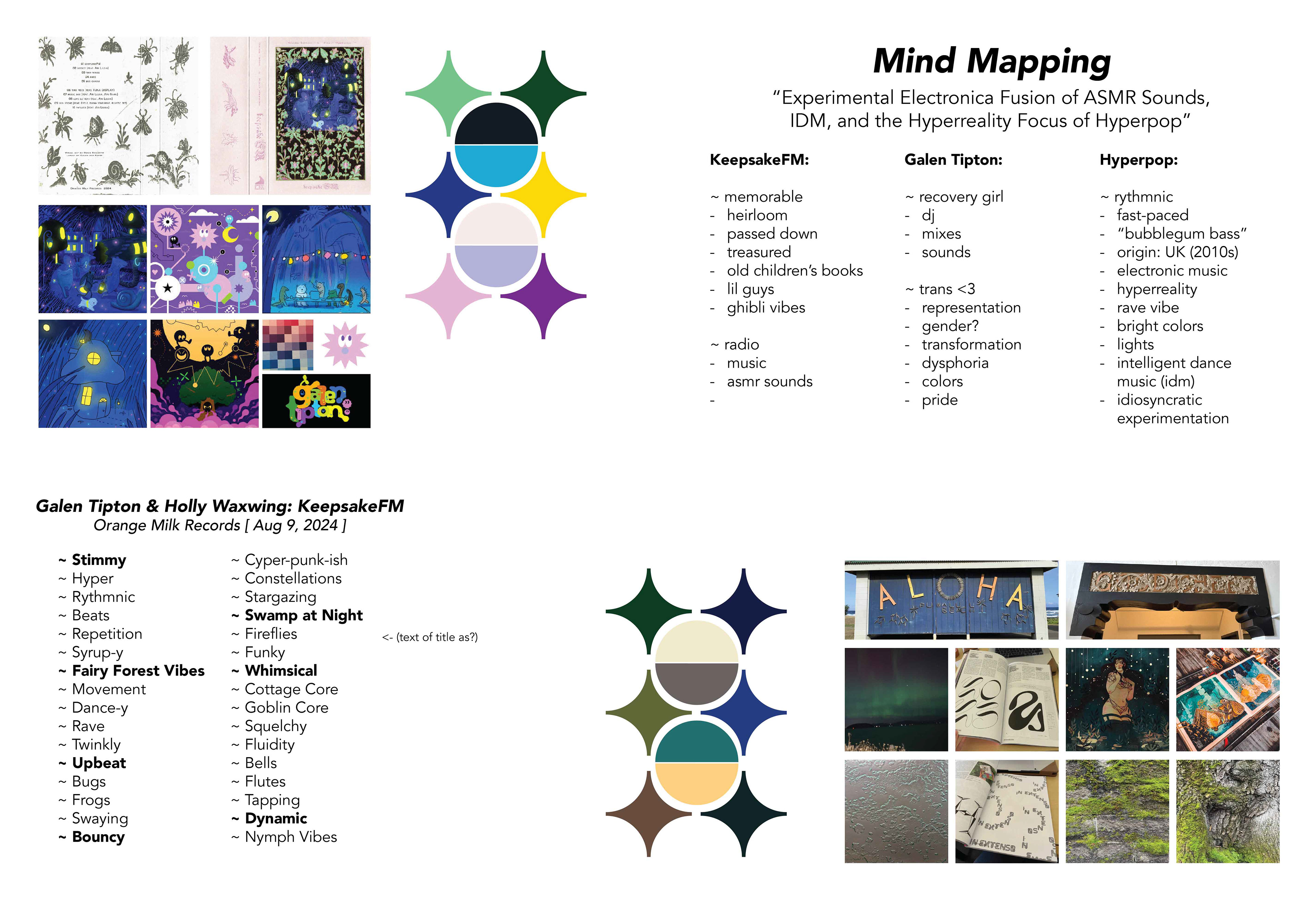
Brainstorming
As I had with my previous vinyl, I listened to this album (and only this album) throughout the project's duration. Alongside that, I reaffirmed that the ambiance of the album itself was whimsical and very playful. Extensive research was done regarding the artists, their inspiration for the vinyl, and concepts that would suit it well.
Additionally, a series of mind mapping was done, and stylized mood boards also included imagery taken from my personal archive of inspiration and experiences. Two color palettes and boards were created to choose from.
Process
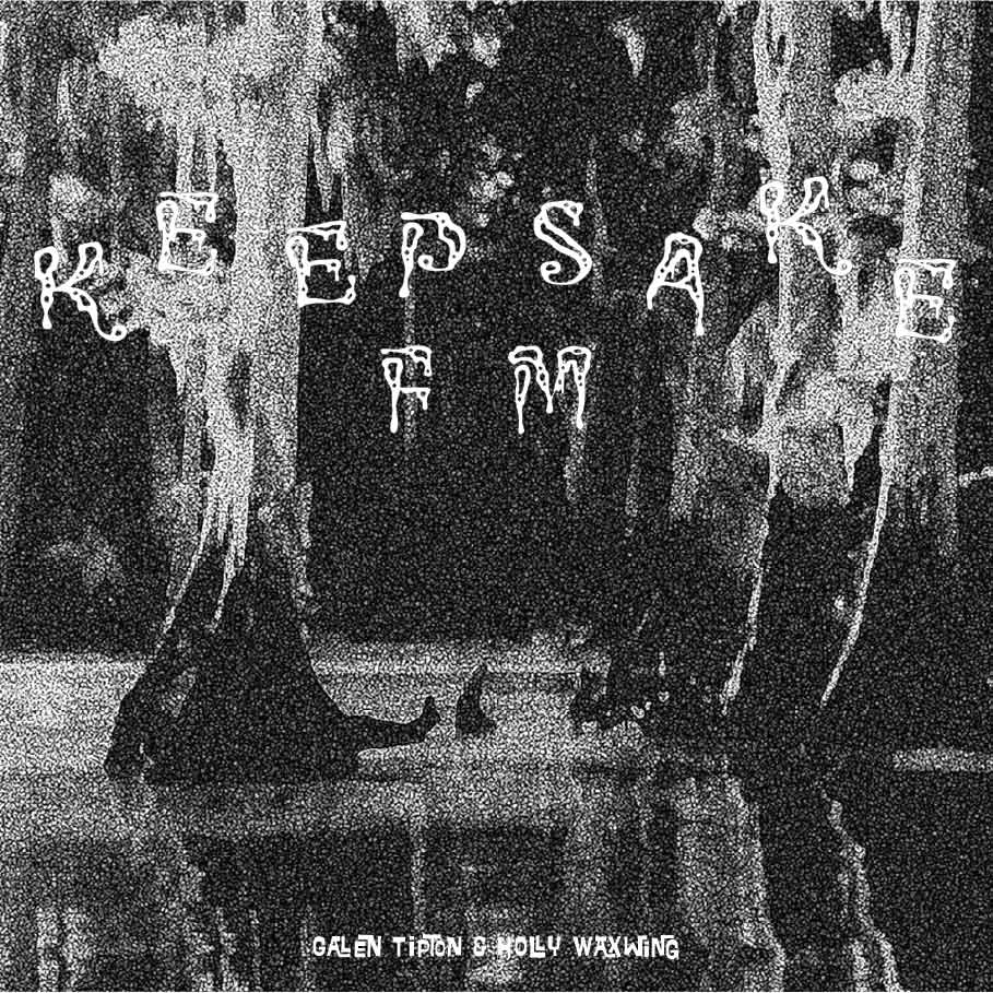
Beginning with more rough black and white sketches, I poured over various typography that seemed to embody elements of the music itself. Inspiration was also taken from imagery of letterforms as fireflies or lanterns in a swamp, as well as "bouncier" typography. Various layouts were tested, with an emphasis on distorting and arranging text to visually convey movement.
In my first iterations, I wanted to take very different approaches, and then user tested it with people in the prospective demographic, both alongside the music and "blindly" by asking which interests them more, or noticing which held their attention.
Listen to keepsakeFM: