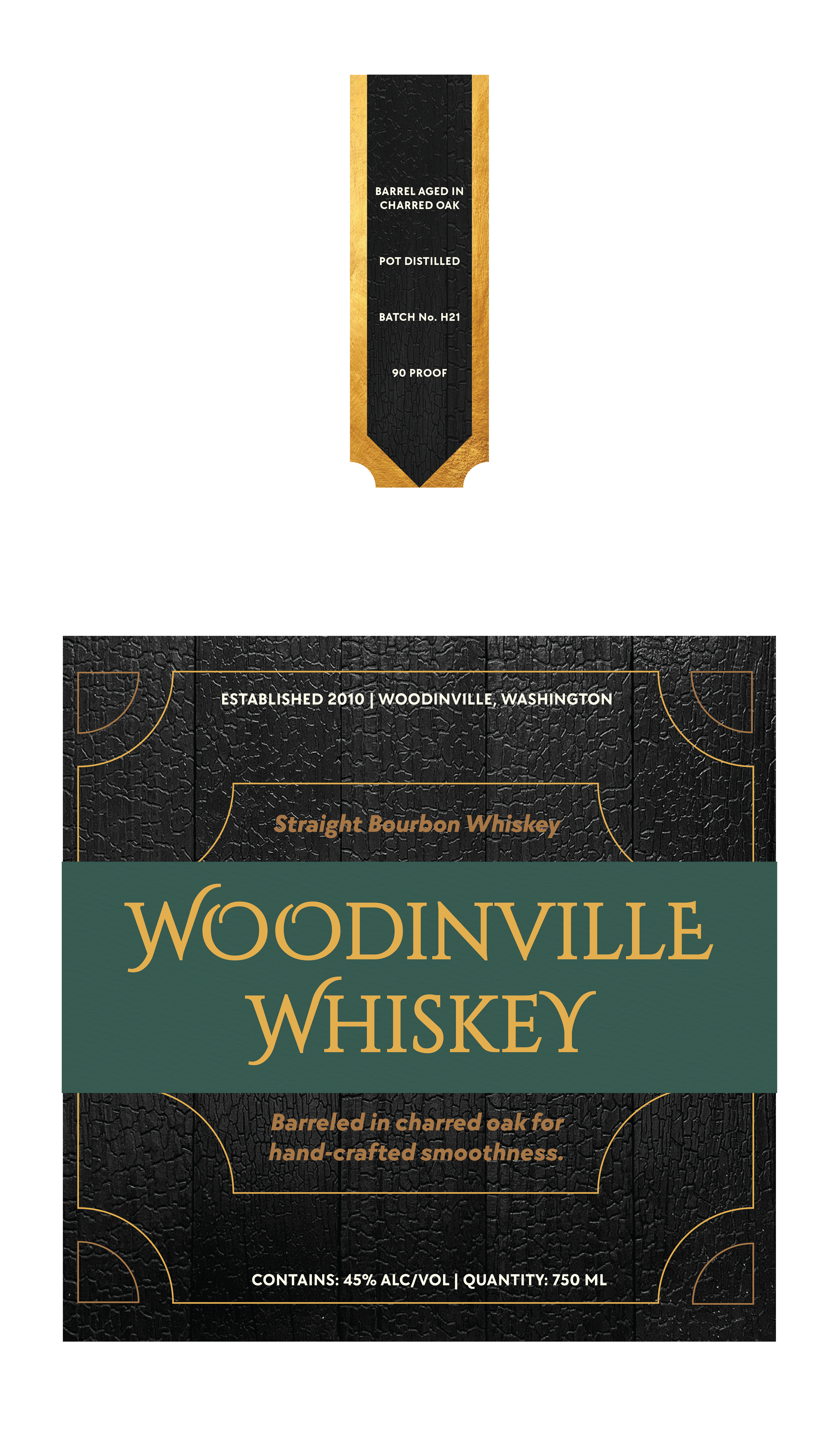
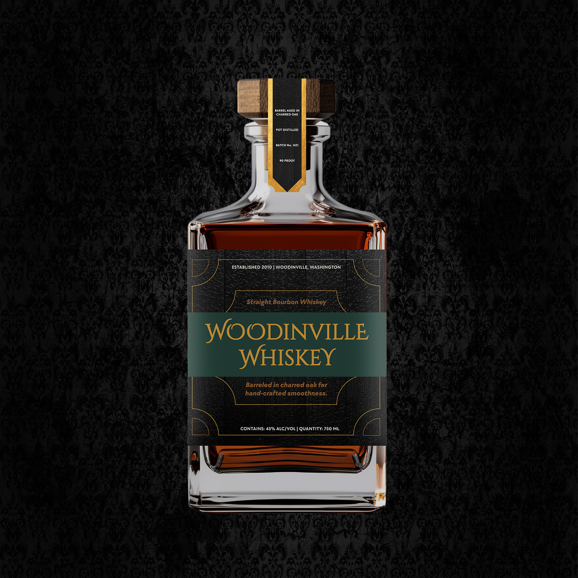
Packaging
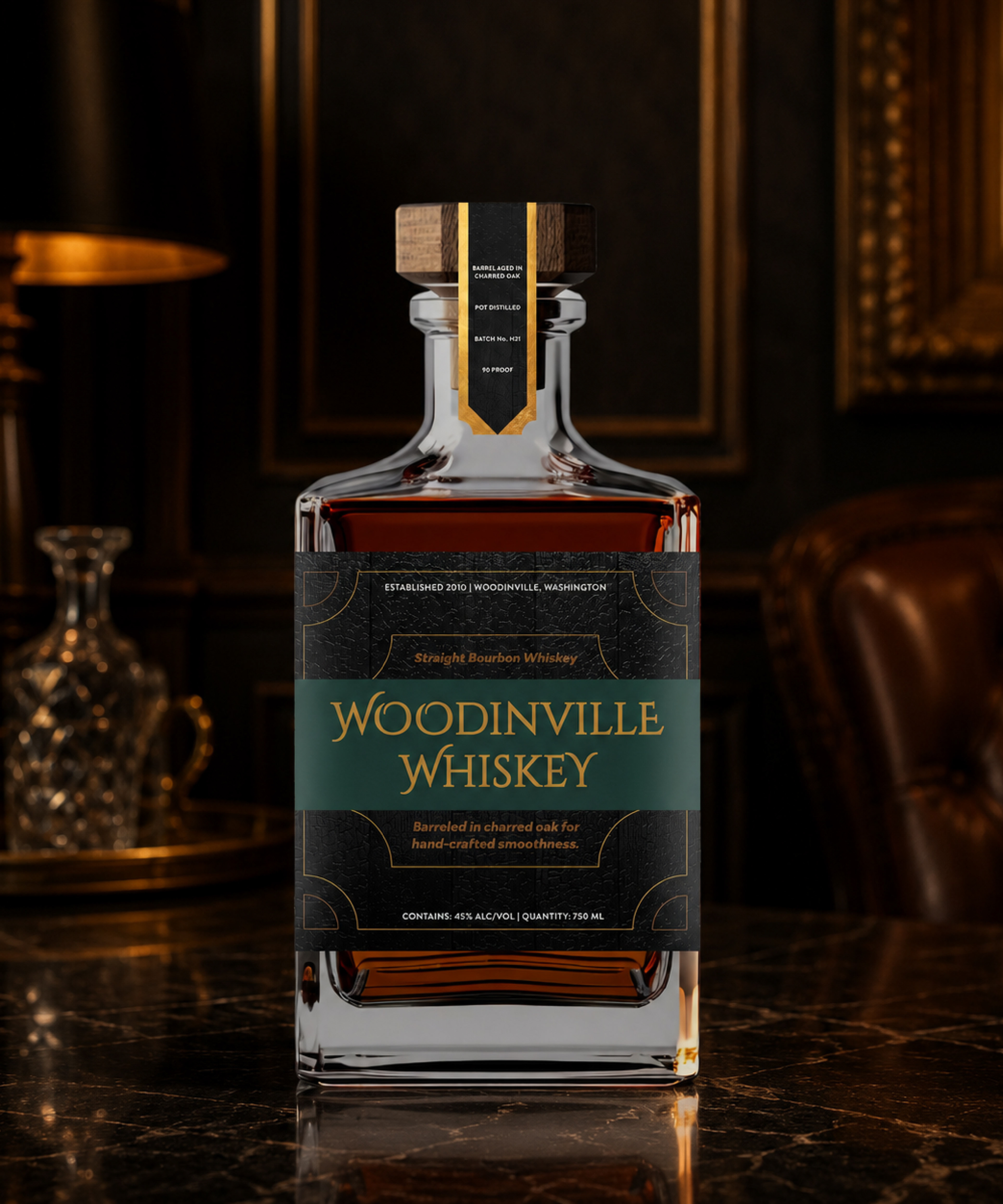
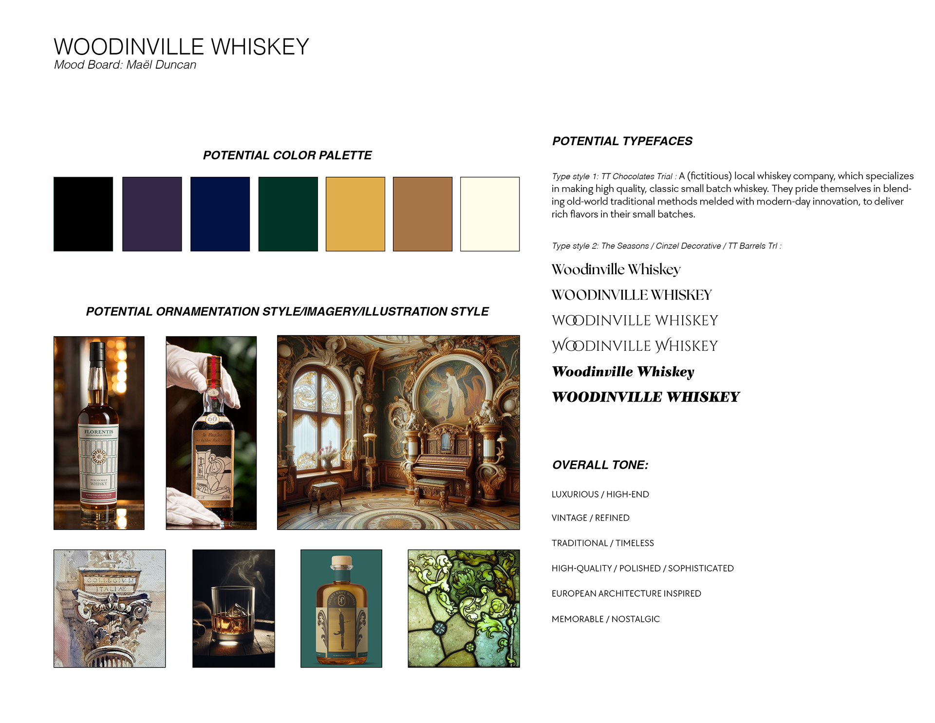
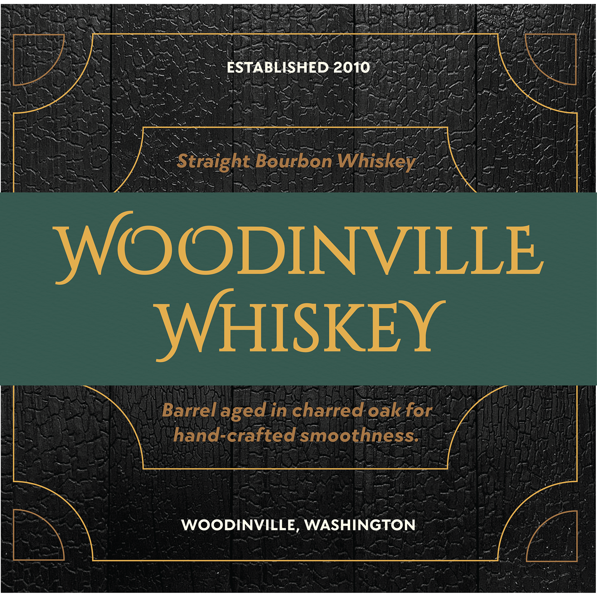
Woodinville Whiskey is a whiskey company specializing in classical, high-quality, and small-batch whiskey. Since their founding in 2010, they have prided themselves on bridging old-world traditional methods and modern-day innovation, with an emphasis on local ingredients and rich flavors.
Objective:
Create updated/ refined packaging for a localized whiskey brand. At present, their market is within the Pacific Northwest. However, they are quickly expanding and need packaging "that can sit comfortably on the shelves with other labels" as they grow their reach nationally, and beyond.
Create updated/ refined packaging for a localized whiskey brand. At present, their market is within the Pacific Northwest. However, they are quickly expanding and need packaging "that can sit comfortably on the shelves with other labels" as they grow their reach nationally, and beyond.
Timeframe: 3 weeks
Roles:
Packaging Designer
Tools:
Adobe Illustrator,
Adobe Photoshop, Google Suite
Adobe Photoshop, Google Suite
Audience:
Market research of the brand's current audience establishes it as adults (mostly men) in the Pacific Northwest. This needs to be adapted for adults nationally, with a more luxurious and traditional feel to entice viewers.
Insight:
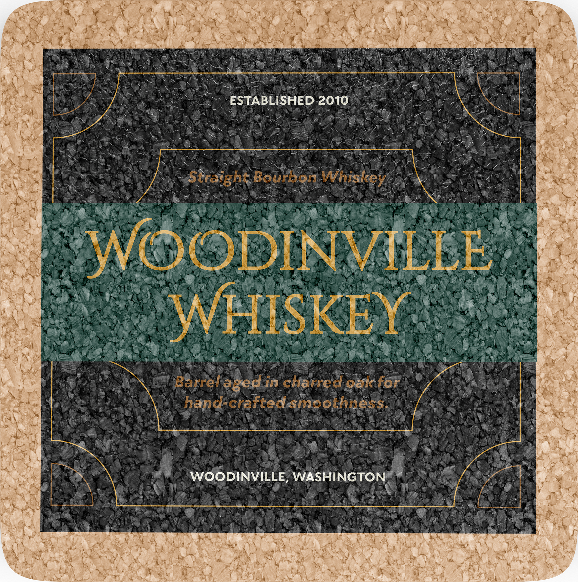
Playing with various typographical styles and layouts enabled me to solidify the impact of hierarchy and set a foundation for the main and secondary labels.